
Mod Flip House — A Tour!

I can't believe enough time has passed to write this, but I'm so excited to share the after photos of the mod house we bought and renovated last year (to view the before photos, go HERE). This is the first time Steven and I have intentionally purchased a flip. The first fixer upper home we bought together was in the housing crash of 2008. It was a long term home we thought we would grow into and renovate over time, but ended up moving for job reasons and sold it in 2014.
We're in a place now where we hope to invest in a couple of flips a year (depending on availability in the market). We have a great team in the upstate and found a process that worked really well for us. We're mostly focused on the surrounding areas of Greenville, SC and love the idea of improving where we live.

I think flips can sometimes denote cheap solutions and half baked ideas, which is the opposite of how I work. We put so much care and intention into this home and truly renovated it as if we would be the ones living there (and if it wouldn't have required massive school changes for our kids, we would have!) While it required lots of hard work with many late nights and weekends, I had so much fun bringing the vision to life. So, without further ado...welcome to the Mod Flip House!
The photo tour is from a combination of iPhone shots I grabbed and CY Photography who took photos for the listing.
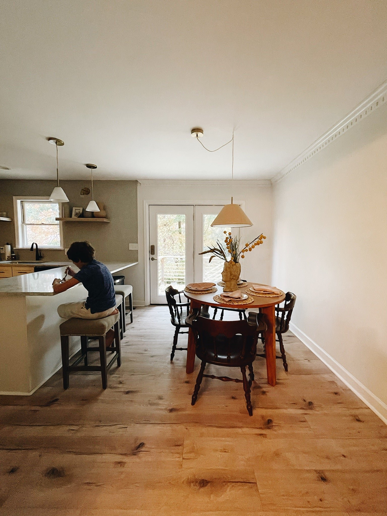
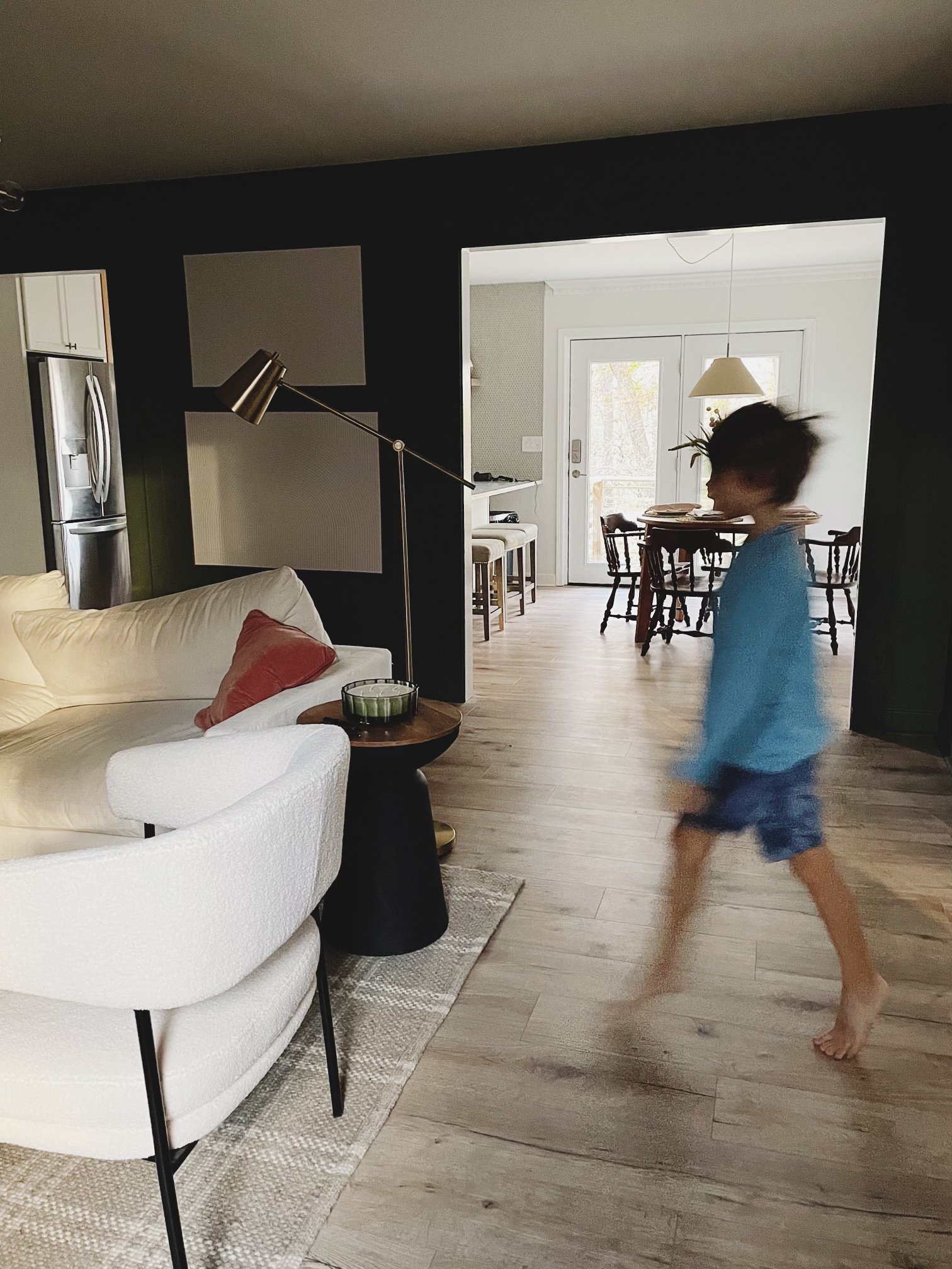
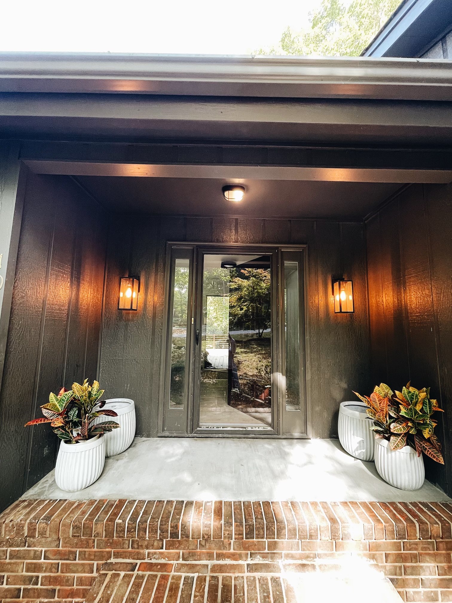
The house is a 3 bedroom, 3 bath with an amazing open concept layout that looks out to nature everywhere! My goal was to open up the interior doorways a bit and keep the focus on all of the views outside. The amazing entryway foyer is what sold the home for me and I planned the entire vision around that Bob Dylan poster and those records I found at a local estate sale...
Chairs | Black Side Table | Luxury Vinyl Plank Floors
There was a water leak and we suspect an insurance claim before we purchased the house because all of the floors were removed and the plumbing had all been redone (a huge cost savings for us and a motivation to keep the original floor plan!). We shored up the floors with all new sub-floor and installed luxury vinyl plank flooring.
We had the popcorn ceilings scraped and I painted all of the main spaces with a fresh white to brighten up the home - Benjamin Moore Chantilly Lace.

I decided to pull in greens and browns to play off of the woods that surround the house and the stunning trees the neighborhood is known for. I took the penny tile all the way up the walls of the kitchen and used shelves to open up the space. I used C and A cabinetry and had Steven build a custom wood range after flipping through this mid century modern home featured in Magnolia.
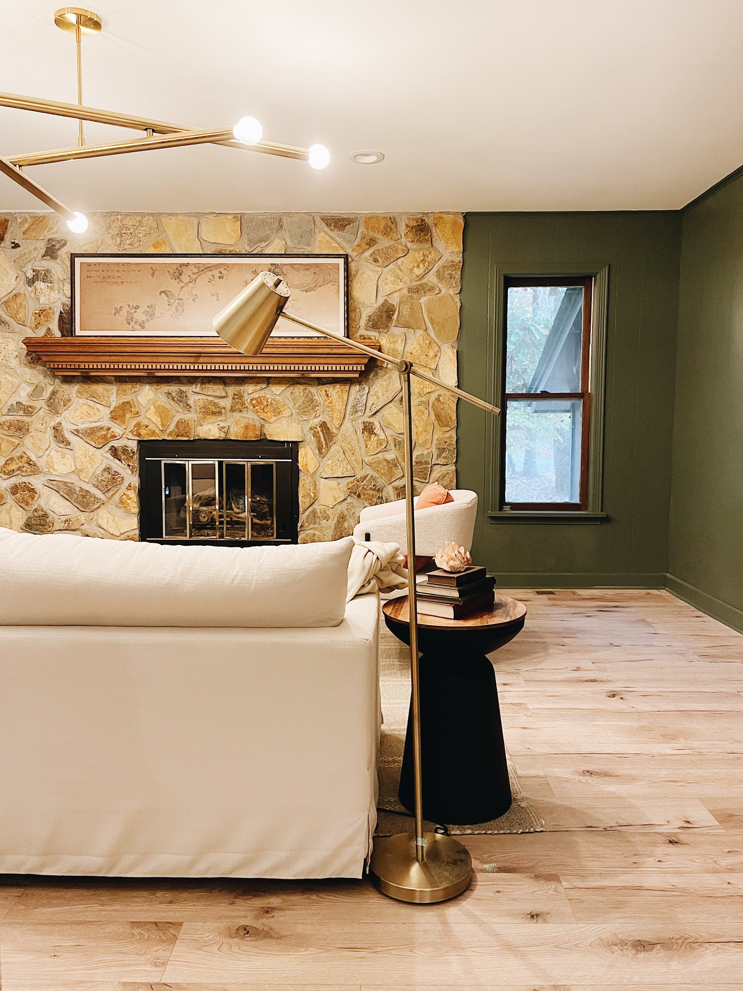
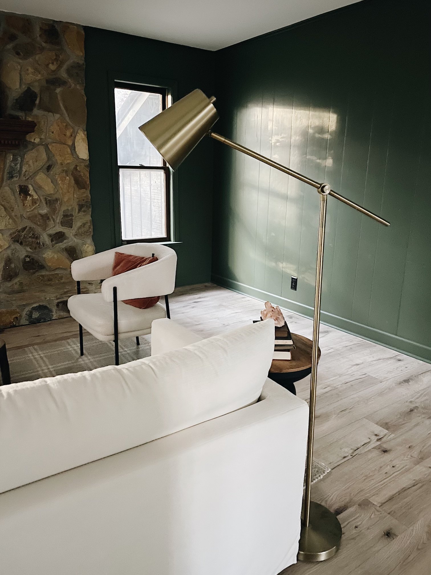
I used my favorite go-to green (Rosemary by Sherwin Williams) on the wood paneling in the living room and got advice from our painter on how to prep the walls and paint the wood. A statement light fixture adds to the statement fireplace with earthy stone, rather than detracts...
The primary bedroom is my favorite room in the house - it feels so calming, like waking up in a nature resort on vacation. I went light and bright after spending hours removing stubborn wallpaper borders and used Accessible Beige on the walls...

We added a closet to the room so it would mirror the existing closet in the primary bath, creating a his and hers organizational space. Because the corner was largely unusable before the addition, the closet worked seamlessly into the floor plan.
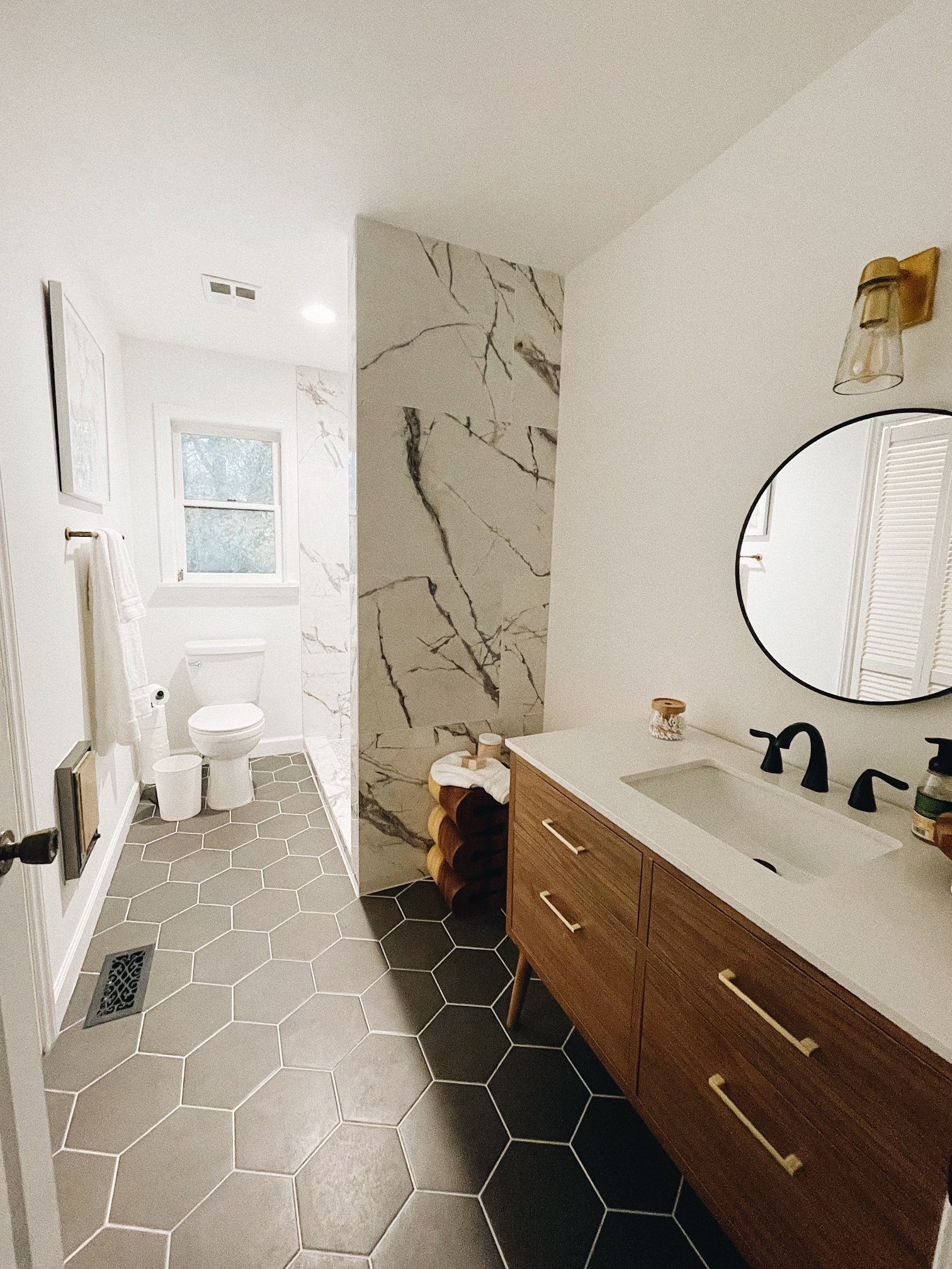
I worked in hexagon elements throughout the house so everything tied together without feeling matchy-matchy - a trick I learned in designing my own spaces for years. We were on such a tight deadline that I did not clean before the photographer came, so don't look too closely at the floor! ;) We did remove a linen closet where the tile wall runs, which opened up the space considerably and allowed the tile to be the show stopper when you initially walk into the room. We kept the small heating unit on the wall (astonishingly, it still worked!) and refurbished the unit with a fabricated metal cover and a can of spray paint.
In the 4 weeks that we lived here I confirmed my long-held position that one-level homes are where it is at with children! Having the kids' bedrooms, the bathroom, and the hallway storage all in close proximity made it so easy for me to keep an eye on messes and instruct the kids to keep things tidy. We filled the closet with tons of storage and as someone who lives in a downtown home with very little closet space it felt like a dream to have a space to put brooms, mops, vacuum cleaner, and other various things you want quick access to but with the option to hide away behind doors.

The kids bedrooms came together so easily. I love these classic Jenny Lind knock-offs from Wayfair with the fun wool leopard rug I found for a steal at the Pottery Barn outlet. The bedding was all mix and match - quilts and square pillows from Target, duvets from Pottery Barn and bolster pillows from Anthropologie. I didn't really strategize here...I just used what I had on hand. Several people have asked about the cursive print on the wall and it is a poster from Papersource that I framed in an Ikea frame. I used my go-to drapery rods and scoured the clearance bins at the PB outlet to find two matching gray linen drapes.
The hallway bathroom is the workhouse of the whole house and despite having a clear vision for all of the other rooms in the home, this space was a total after thought. I absolutely LOVE how it turned out and think we gave the 70's such an upgrade with this space. I had our tile guy stack the wall tile vertically and used a minty grout to draw your focus to the pattern NOT the grout lines. I'm obsessed with it and want to work it into future projects. The champagne bronze shower fixture pairs beautifully with the tile and I brought in the hexagon theme with a larger tile format and some dimension to the color.
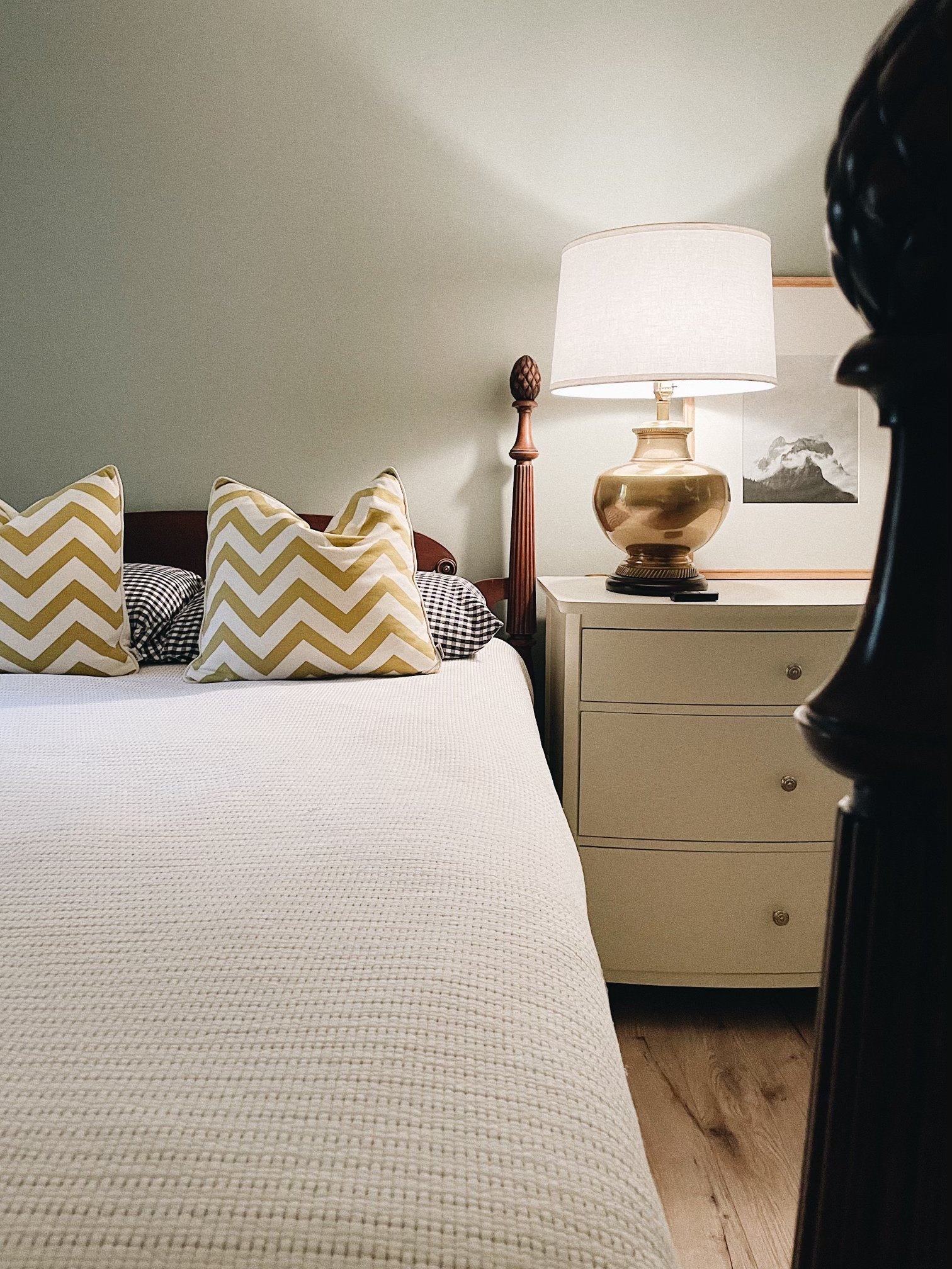
This bedroom made me fall in love with walls in Unusual Gray and I brought some of the leftover paint from this room to a bedroom in our downtown house. I thrifted the 4 poster bed, found the rug at the Crate and Barrel outlet, and used a dresser as the nightstand (a trick I now love to employ for rooms that need extra storage!). I love a good statement lamp and the brass with the wall color just made the room for me!
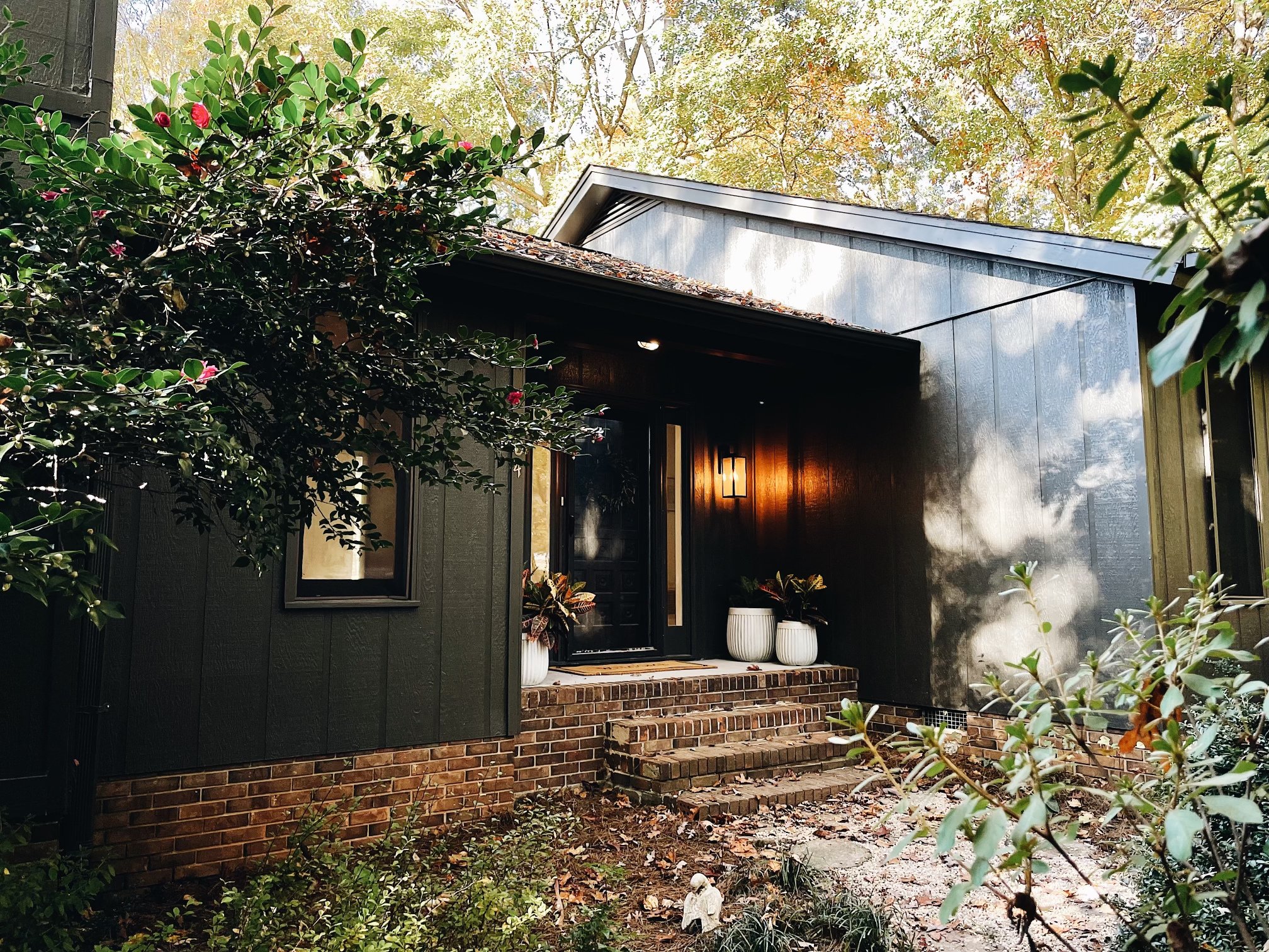
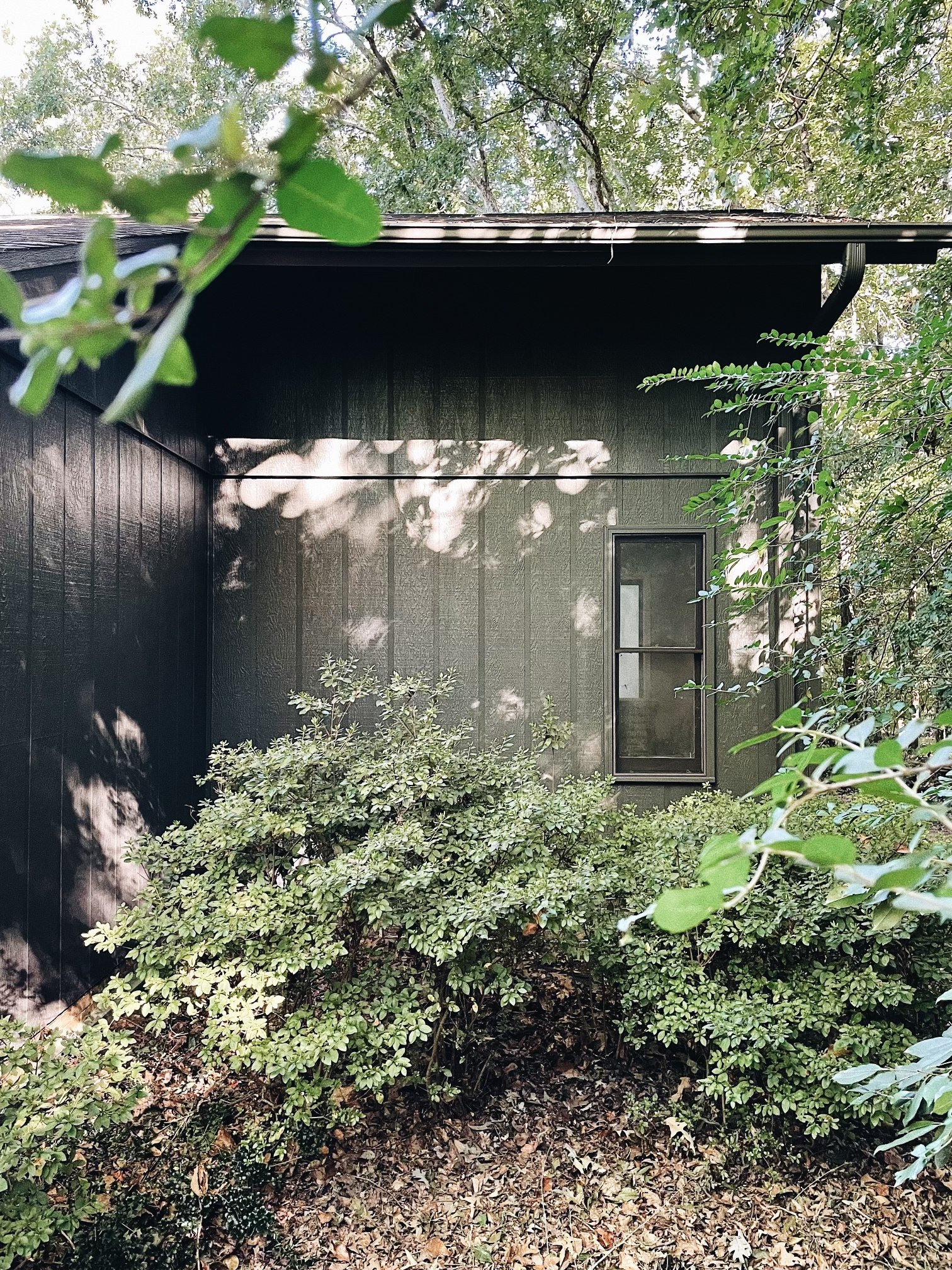
The exterior needed some repairing but was in great condition overall. I knew I wanted to keep the exterior moody and dark and after much deliberation we hired a crew to paint everything in Urbane Bronze. It felt like such a commitment but once I saw it going up I couldn't stop staring -- photos really don't do it justice!
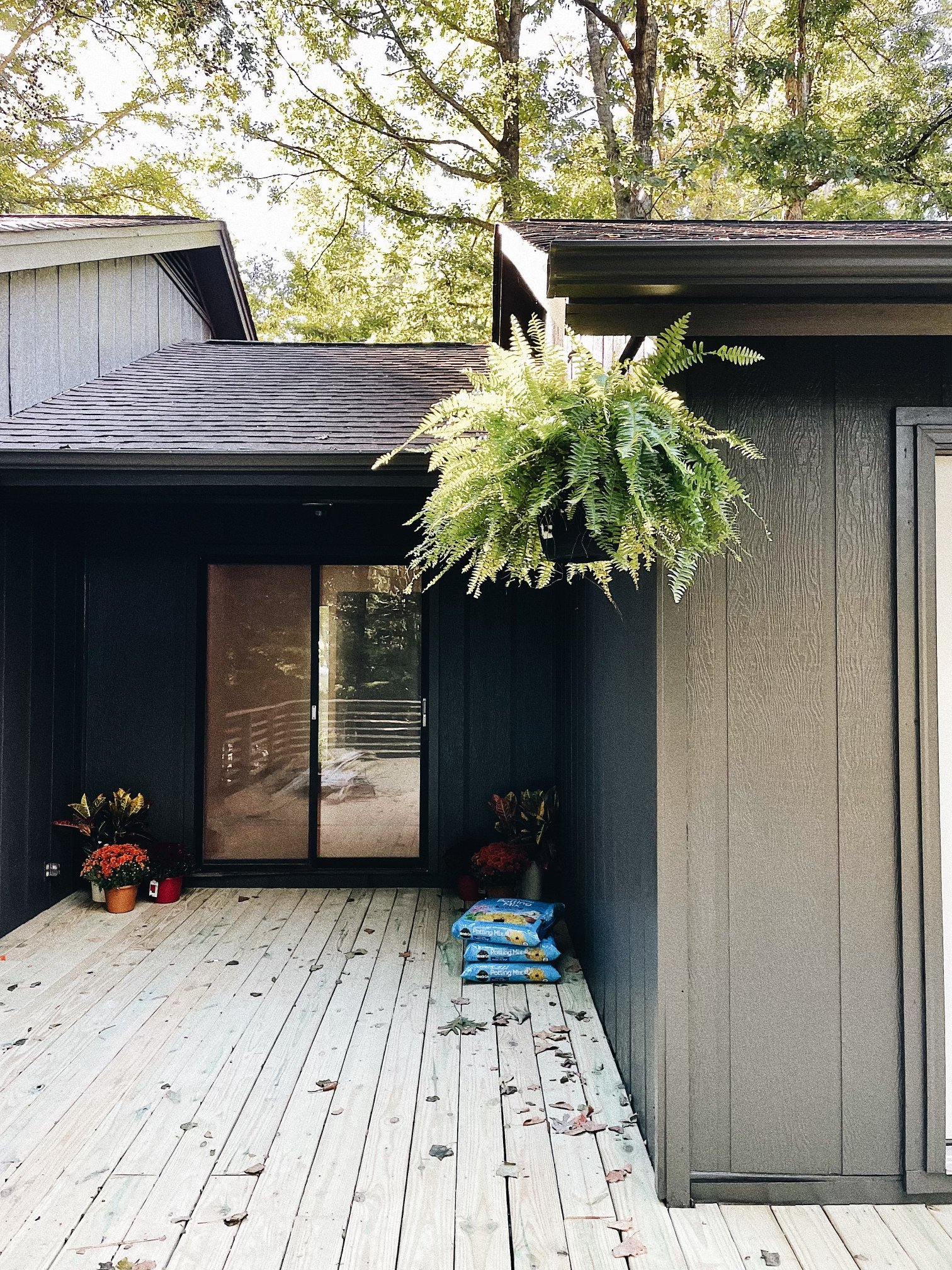
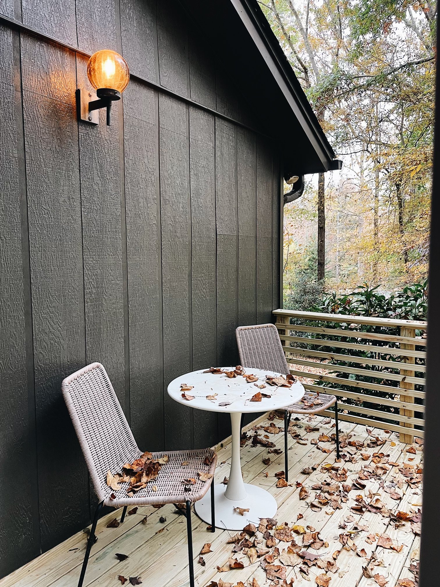
In keeping with the nod to mod we collaborated with the installer for the deck to create a horizontal design that stayed within our budget. With the new exterior color and the dark sliding doors it turned out so well -- jealous of the home owners who will get to use this space for hosting!
And that's the full tour! We listed it in October and were delighted to receive multiple offers. We're absolutely thrilled for the new home owners and so proud of all the work we did to make this place a soft place to land in the woods.